http://www.gunter-rambow.com/index2.html

 |
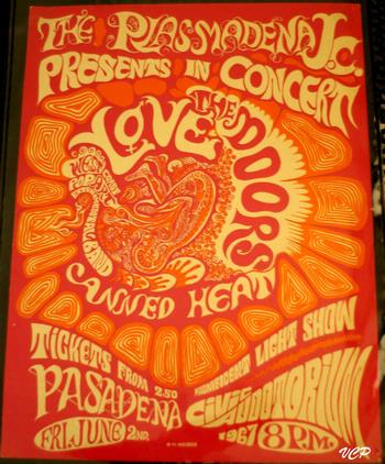
| I have always been into the psychedelic aesthetic of the 60s and 70s since I could remember being into art. The Beatles Yellow Submarine was my favourite film growing up, and I've always found the type of this movement to be both aesthetically pleasing on all levels. I like when type is used as imagery, an that is something the psychedelic graphics does really successfully - especially on old gig bands as shown below. This is something I have certainly explored throughout my practice and am always looking to try out new styles. |


My own interpretation of Jim Morrison's lyrics for The 27 Club submission:


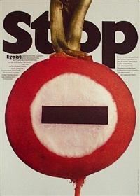
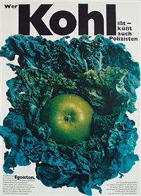
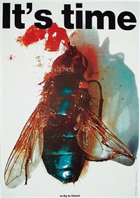
Gebrauchsgraphik (1968)
The German word for 'commercial art' these were a collection of graphic designs (prints, typefaces, typography, stamps, movie posters) used as advertising graphics in the year '68. I would like to be able to simplify my work down to this level, where the type and / or shape alone can be so impactful. I also really like the abstractness of certain images, minimal colour, and focus on geometric form.


 Matthew Leibowitz
'Starting in 1942, Leibowitz established a freelance practice in visual communications. He designed advertisements, packaging, brochures, logos, annual reports and identity campaigns for major American and European corporations and advertising firms.
Leibowitz’s designs displayed an acute visual intelligence. Not only were the designs powerful they were consummately made. Leibowitz’s typography was all hand done. His designs were an eclectic aesthetic mix: the engravings hark back to Dada and Surrealism, the photography probably a Brodovitch or Beall influence, the cantilevering of lines and planes from Constructivism. Of his practice Leibowitz said:
Whether precise as geometry or sculptural as stone, it must declare a clear, direct, and strong visual statement, complete as such.'
Heinz Edelmann
Heinz Edelmann (1934- 2009) was born in Czechoslovakia, and from 1953 to 1958 studied and then worked at Düsseldorf Academy of Fine Arts with a keen interest in print making. In 1958 he became a freelance graphic designer and by the time he was 30, he was among the most promising designers in Europe. He did innovative work for the avant-garde German magazine Twen, including drawings on the horrors of war. He made Yellow Submarine the first full-length feature cartoon in the UK since Animal Farm (1954). In 1970, Edelmann moved to Amsterdam and designed posters for plays, films and book jackets. Later he moved to Stuttgart, and worked as a professor at the Stuttgart Academy of Fine Arts.


Heinz Edelmann (1934- 2009) was born in Czechoslovakia, and from 1953 to 1958 studied and then worked at Düsseldorf Academy of Fine Arts with a keen interest in print making. In 1958 he became a freelance graphic designer and by the time he was 30, he was among the most promising designers in Europe. He did innovative work for the avant-garde German magazine Twen, including drawings on the horrors of war. He made Yellow Submarine the first full-length feature cartoon in the UK since Animal Farm (1954). In 1970, Edelmann moved to Amsterdam and designed posters for plays, films and book jackets. Later he moved to Stuttgart, and worked as a professor at the Stuttgart Academy of Fine Arts.
No comments:
Post a Comment